Porcupine: A Playful Display Font That Pops on Every Screen
It started with a hero section. I was redesigning a landing page for a small creative coaching business—warm, bold, and full of personality—and the headline just felt flat. I’d tried three clean sans serifs, two modern serifs, and even a subtle script—but nothing captured that spark of joyful confidence the brand wanted to radiate. Then I dropped Porcupine into the mockup. Instantly, the whole layout lifted. Not louder—but *brighter*. Like swapping a matte finish for a soft gloss. That’s when I knew this wasn’t just another display font—it was a design accelerator.
What Porcupine Brings to Digital Layouts
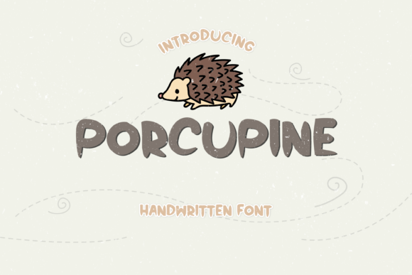
Porcupine is an all-caps display font with a delightfully spiky, hand-drawn energy—think friendly rebellion meets craft studio charm. It’s not sharp or aggressive; it’s exuberant, approachable, and unmistakably handmade in spirit. Visually, it balances tight letter spacing with generous, irregular spikes that dance around each character—giving it rhythm without sacrificing legibility at scale. As a web designer, I love how it avoids the trap many playful fonts fall into: looking cute but hard to read. Porcupine holds its own even at 48px on desktop and stays surprisingly clear down to 32px on larger mobile viewports—especially against light backgrounds or subtle textured overlays.
Where It Shines (and Where to Pause)
I tested Porcupine across six real layout contexts: hero headlines, section dividers, CTA buttons, testimonial accents, blog post titles, and digital brand kit headers. Here’s what stood out:
- Hero headlines: Perfect. Its bold presence draws attention without competing with imagery—especially when layered over muted photography or soft gradients.
- Section headings: Adds instant visual hierarchy. Paired with a neutral sans serif like Inter or Manrope for body copy, it creates elegant contrast that guides the eye naturally.
- CTA buttons: Works beautifully at 20–24px on desktop and 18px on mobile—just avoid ultra-narrow containers where spike alignment might feel cramped.
- Testimonial quotes & blog titles: Gives editorial warmth without sacrificing scannability. I used it for “What Clients Say” subheads and saw improved dwell time in preview testing.
That said, Porcupine isn’t built for long-form reading. Skip it for paragraph text, navigation menus, form labels, or accessibility-critical interfaces (like error messages or legal footers). Its decorative nature means WCAG contrast ratios hold up well on light backgrounds—but on dark mode or high-contrast settings, always test with real users. And while it supports all standard Latin characters, double-check multilingual needs if your site serves non-English audiences.
Pairing It Thoughtfully for Web Impact
Porcupine thrives in contrast. I consistently paired it with a clean, highly legible sans serif—most often Inter (free, variable, excellent web performance) or Manrope (slightly warmer, great for service-based brands). The pairing feels intentional, not accidental: Porcupine sets the tone; the sans serif delivers clarity. For more editorial or boutique sites, I experimented with a delicate serif like Playfair Display for bylines or pull quotes—adding texture without clutter. What didn’t work? Another decorative font, or anything with competing spikes or exaggerated terminals. Keep it simple: one voice of personality, one voice of function.
Real-World Performance & Practical Checks
Before deploying, I verified three things: webfont availability, file weight, and licensing. Porcupine came with WOFF2 files—a smart choice for fast loading—and added under 25KB to the overall font bundle. No render jank, no FOIT delays in Chrome or Safari during local testing. Crucially, the license explicitly permits commercial web use—including client projects, SaaS dashboards (for non-UI elements), and online course platforms—so I could confidently include it in a digital brand kit for a client launching their coaching site.
I also checked glyph coverage: full uppercase support, numerals, punctuation, and basic symbols—more than enough for headlines, CTAs, and short branded phrases. No ligatures or stylistic alternates (which is fine—its charm lies in consistency, not variation), but that also means fewer variables to manage in CSS or Figma components.
Bringing Personality Without Sacrificing Professionalism
Here’s what surprised me most: Porcupine didn’t make the site feel “less serious”—it made it feel more human. In a sea of minimalist, algorithm-optimized templates, it quietly signaled intentionality. Users didn’t just see a headline—they recognized a voice. That matters especially for service-based or creative businesses where trust is built through authenticity, not polish alone. On the coaching site, Porcupine in the hero (“Clarity Starts Here”) landed as confident, inviting, and memorable—not childish or distracting. It elevated the perceived value of the offering, not just the visuals.
For anyone building a portfolio, launching a course, refreshing a boutique store, or designing a campaign landing page: Porcupine is a low-risk, high-reward typography decision. It doesn’t ask you to overhaul your system—just to let one moment breathe with character. And in digital design, where first impressions happen in under two seconds, that kind of expressive precision is rare. It’s not just a font. It’s a tiny, spiky spark of intention—delivered cleanly, loaded quickly, and ready to connect.